Responsive Web Design – fits all sizes
Updated: October 11, 2023
Published: March 6, 2013
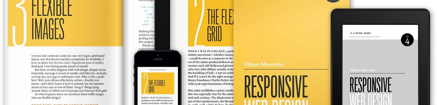
Responsive web design (RWD) is a concept that has turned the design world upside down. Responsive web design allows consumers device’s screen size and the web content interact together. Founded by web designer Ethan Marcotte in 2011, experts in the field like Treehouse blogger, Nick Pettit and responsivewebdesignblog.com creator, Chris Swemba describe responsive web design as, “the future of the web.”
As technology continues to evolve so does the way the consumer gathers information and engages with a company’s brand. The amount of devices used to search web are endless (smartphone, tablet, netbook or laptop) and all those devices come with different size screens. In the past, companies would have two separate websites, one for mobile and one for regular web searches. However, responsive web design uses fluid grids, flexible images and media queries, which produce one adjusting website that will adapt to whatever screen. To learn more visit Keystone Click’s responsive web design 101 page.
When surfing a responsive web design website the user can adjust the width of the website browser and the content will adjust accordingly. This coding language can transform a company’s web presence and make their business a front-runner in the field due to the fact their target audience is getting the optimal viewing experience. It is simple. An adaptive website is morepleasing, engaging and contemporary.
Ethan Marcotte’s recently posted a great resource for responsive web design examples:
Does having a responsive web design website really make all the difference? And how exactly does responsive web design improve the online and mobile presence of a business? Both valid questions, one obvious way is through convenience. The target audience will have no issues gathering information anytime, anywhere. Depending on the screen size the content will adjust in order to stay relevant. In a sense the website is making itself more accessible by being more versatile.
Secondly, the difference between a responsive design website and a regular design website is clear. The fluidity creates a sleeker or more advanced feeling to the website. Your audience will notice when the website transforms into a mobile or tablet friendly width. Responsive web design creates the “wow” factor due to the fact that the website is catering to viewers.
Finally, responsive web design sites require less code and are preferred by search engine sites, such as Google. When search engines prefer a certain type of website, this can lead to more consistent clicks and better opportunity for consumers to search your keywords.
2013 will be the year of responsive web design.
Although, responsive web design is a fresh concept, the technology behind it and the benefits are too great to ignore! 2013 will be the year of responsive web design. Companies will now have consistent websites for all screens no matter the device while the consumer will have convenient access to any information anytime. It would be wise to jump on the responsive web design bandwagon because 2013 will be the year of revamping your company’s online presence ultimately reaching endless online advertising opportunities.
Does your website stand above the rest? To test your website here and see whether it is compatible with mobile and tablet devices. When it comes to promoting your business, the internet is a tool that should be used to the fullest, do not be stuck in last year, make your website responsive.
Post by KEYSTONE CLICK.
Keystone Click’s Guide to Profits

As a business owner or marketing executive, you are faced with the challenge of bringing in new prospects and converting them into customers. Our free downloadable, Guide to Profits, gives you tips and tricks to build brand awareness, generate leads, and nurture those opportunities.