Sneak Peek: Pantone’s 2022 Color Trend Predictions
Updated: October 11, 2023
Published: October 25, 2021
The past couple of years have certainly been a wild ride, and worldwide we’re all ready for something new. Predicted colors for 2022 are all about youth, life and rejuvenation, which is something we all could use a little bit more of going forward. But before we get into exactly what those trend predictions may be, let’s take a step back to remind ourselves what color is and why it matters more than just how trendy your outfit is.
Why Does Color Matter?
Obviously, color is everywhere you look. But why does it matter, besides making our lives more interesting and surely more visually appealing? When color is used correctly, it can be quite effective for a multitude of purposes. Most of these objectives can be reached through the employment of color theory — which is the science and art of using color, including how people perceive color and the visual effects of how colors mix, match or contrast with each other. Additionally, color theory involves the feelings and messages colors evoke as well as methods used to replicate color. You may remember a color wheel in art classes as a kid. The color wheel is the basis of color theory.
Psychology of Color
While related to color theory, color psychology is a bit different. The psychology of color is the study of how colors affect perceptions and the behaviors that follow those perceptions. In the case of digital marketing and web design, color psychology is all about how colors affect consumers’ perceptions and what actions they take concerning a brand because of those perceptions.
How Can Color Help Your Biz?
According to color psychology, color is a way to change actions, persuade and cause a wide range of emotions, so much so that it’s often used as a cultural symbol. Knowing this, there are some good ways you can incorporate color to your marketing for your business’s advantage – even going as deep as painting the office a color that will make your team more productive. Check out these colorful tips to give your business an edge:
- Is your office always cold? Try painting the walls a warm color. This can cause people to perceive a warmer temperature in your space. Maybe you’ll even save a few bucks on heating! (This works vice-versa too, for those of you in warmer climates.)
- Green is linked with creativity and an open mind, not to mention that it’s a generally well-liked color associated with positive growth. If you’re looking for more productivity and creativity, fill your office with green.
- There’s a reason that red is often associated with anger – it typically makes reactions faster and more forceful, causing a short boost of energy that could actually reduce analytical thinking. Red is not helpful to stay on task and could be associated with the red pen your teacher used to mark up your papers as a child.
- Ever wonder what the most common favorite color is worldwide? It’s blue! This positive association could be evolutionary but know that this color is likely to satisfy the largest majority of people.
- Yellow is the opposite of blue in that it’s typically the least-liked color, though those that do like color have a strong preference in its favor.
- Orange is associated with good value, helping customers view your brand as low-cost.
- Pink is known to be calming or even draining. Certain shades of pink can calm people down for 30 minutes, and even longer depending on the hue.
- Though white has a modern appeal and brings to mind modern, luxury brands like Apple, too much of a white monochromatic palette can actually bore people.
Pantone Color Predictions for 2022
At the beginning of each year, the Pantone Color Institute chooses one color that it believes will dominate the trends of that year. Lucky for all you early birds, Pantone also makes some predictions ahead of time in conjunction with New York Fashion Week. Leatrice Eiseman, Executive Director of the Pantone Color Institute said this about the spring/summer 2022 palette:
“Colors for Spring/Summer 2022 bring together our competing desires for comforting familiarity and joyful adventure through a range of soothing and timeless colors, along with joyous hues that celebrate playfulness. As we enter this new landscape where fashion rules no longer apply, hues for Spring/Summer 2022 allow us to mix and marry as we please, encouraging the exploration of new chromatic realities, and opening the door for personalized style and spontaneous color statements.”
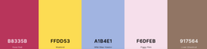
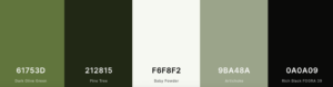
Ready to try it out? We’ve had some fun designing trendy color 2022 palettes using coolors.co. Check out the following palettes for inspiration and then try them out yourself.
Joyful Adventure
Comforting Familiarity

Soothing and Timeless
Playful

Keystone Click’s Guide to Profits

As a business owner or marketing executive, you are faced with the challenge of bringing in new prospects and converting them into customers. Our free downloadable, Guide to Profits, gives you tips and tricks to build brand awareness, generate leads, and nurture those opportunities.